Hello, and welcome to planet Earth. The Earth is a planetary body that revolves around the sun… unless you are one of the many Metro-North riders that have the erroneous belief that the world actually revolves around them. Those special people are known to cause scenes on the morning train (like the woman I saw last week yelling, “for every minute we’re late I’m docked pay!”), and somehow have the strange belief that Metro-North has one train running on each line: their train. The remainder of us, however, are well aware that the busiest commuter railroad in the country certainly has more than 3 trains running at a time. But how many? And where are they?
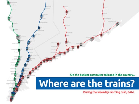
I had a kind of silly idea – I would create a map that showed the location of every Metro-North train at an arbitrary time during the morning rush. That way people would be able to really visualize how many trains there are, and to understand that they aren’t alone on the rails – not by a long shot. The map would provide a quick snapshot of what exactly is happening on every weekday morning. Somehow along the way the map turned into a little bit more interactive of a piece – using Google maps, one can zoom in and out, pan, and click on each train placemark for more information. Then I got a little bit more crazy – I added in the Shore Line East and Amtrak trains passing over Metro-North territory, as well as the deadheads I was aware of. If anything, there could be more trains than what are currently shown, but for the most part it is fairly exact.
If you click the above image, the interactive map should open in a new window. You can click any train placemark for more information. Any train deadheading (moving from one place to another, but not carrying passengers) will be labeled “not in revenue service.” You can also toggle on and off the various lines to, for example, show only Harlem Line trains. By default all trains are turned on – and there are quite a lot of them. Did you realize there were quite that many? Perhaps the subtitle of this map should be “RTC’s are awesome and I salute them.”
I must thank Eric (@kc2hmv) for doing quite a bit to help me get this map looking awesome, as my programming skills are nonexistent (the toggle feature was all him!). Secondary thanks goes to this site, as I based the design of my map off of the clean and nicely done commuter map found there.


Awesome map! Thanks for putting in all the work. I love your blog.
Thank you!
Brilliant map. Brilliant blog. Long live the Harlem.
That’s really cool! And definitely a great way to explain to the novice/idiot passenger just how busy the system is and how unimportant THEY are in the scheme of things. Thanks for posting it.
Wow – that was just an awesome idea you had (to ID all the trains on the line at the same time) and a really great map.