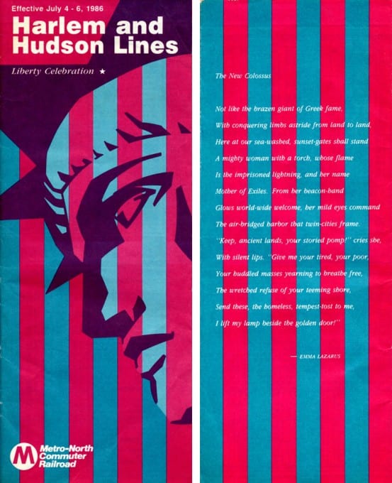
After neglecting to post the usual bit of history the past two weeks, I am back with something new! Or should I say, something old. At some point within the past year I started collecting cool Harlem Line timetables… and one of my favorites is this Independence Day Metro-North timetable from 1986. It is a bit newer than some of the previous things I’ve posted. At least I was alive in 1986… though I still hadn’t reached my second birthday yet.
Really I don’t think they make them this nice anymore. But then again, Metro-North is probably worrying more about the budget than having pretty timetables (at least one would hope… but really, Metro-North, I could design some nice things for you). The timetable is a joint schedule for Harlem Line and Hudson Line trains for the holiday weekend. Instead of the normal blue and green for those respective lines, the timetable uses magenta and cyan. The Statue of Liberty graces the front, and a poem by Emma Lazarus on the back.
Even if you don’t recognize the name Emma Lazarus, or the title The New Colossus, you should at least recognize some of the words…
Give me your tired, your poor,
Your huddled masses yearning to breathe free…
The poem was written in 1883, and was put on a plaque at the Statue of Liberty in 1903… and probably a million other things since then. It refers to the immigrants coming to the United States, many of which saw the Statue as they arrived at Ellis Island. Immigration is a bit of a taboo subject to discuss nowadays, but it is true that historically immigrants had a significant impact on the growth of the United States. And even on the railroad… Chinese immigrants provided much of the labor for the first transcontinental railroad in this country. So in a little way, this railroad timetable is perfect in its symbolism. But that is just me overanalyzing things… have a happy holiday weekend everyone. If you’ll be taking the train, be sure to check out the holiday schedule here.


Emily, doesn’t the cyan-and-magenta color scheme violate some sort of design guideline? It’s really strong…
How would you redesign the Metro-North timetables?
The two strong colors are a little garish, but I don’t think they look quite as bad on the actual piece as they do in the scan. The stripes do make it difficult to read the poem on the back. I assumed that the two colors cyan and magenta were used for cheaper two-color printing purposes, but I have no idea. Perhaps I just like it because it is something different.
As for what I’d do for Metro North? Lol, I have no idea, but I always thought it would be fun to be a designer for them, as I am not sure if I could give up design and go be a conductor or something (which I have a friend trying to convince me to do).
I’d love to see inside of the timetable and see what kind of trains ran and what stops they made.