I’ve been joking around recently that the next time someone asks me why I like the Harlem Division/Line, I am going to answer that “I am a girl, and I like the color blue.” Because clearly female railfans choose their favorites based upon color! If that were the truth, then my second favorite line would have to be the Pascack Valley, as the color for that line is purple. Much to my chagrin, none of Metro-North’s printed timetables for the line are actually printed in purple (so I had to make a fake one – which is below). New Jersey Transit, however, does print timetables for the Pascack Valley line, and they are purple! Since we’re now touring the Pascack Valley line (and I not-so-secretly love old railroad timetables), I figured it would be appropriate to check out some of the printed materials that have been used over the years.
A few of the older timetables you’ll notice use the name New Jersey and New York Railroad, which was used up until the Erie-Lackawanna merger. You’ll notice that the one EL timetable I’m posting from 1969 does actually use the name Pascack Valley. Most of the timetables I have for show are more current, from both the New Jersey Transit and Metro-North. I’m sorry to have to say it, but the NJT timetables are quite a bit nicer, and actually purple. Metro-North has always been all about trying to cram as much junk onto the front of their timetables as possible… which is not necessarily the most aesthetically pleasing. The newest east-of-Hudson timetables have a horrible and cheap-looking drop shadow, at least the west-of-Hudson timetable missed out on that crappy treatment!
Can’t we just go back in time to the late 1800’s or early 1900’s when timetables were beautiful and actually looked like this?
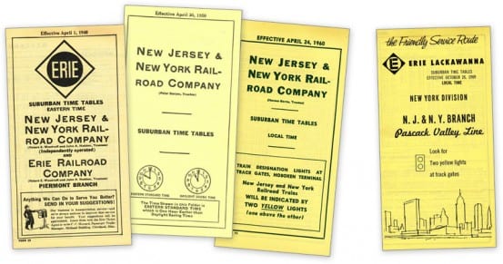
Early timetables from what is now known as the Pascack Valley Line. From the collection of (the awesome) Otto Vondrak.
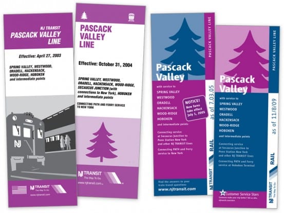
New Jersey Transit’s timetables for the Pascack Valley line feature the color purple, and a pine tree, both of which represent the line. Although Metro-North also uses the color purple to represent the line, they do not make use of the pine tree image.
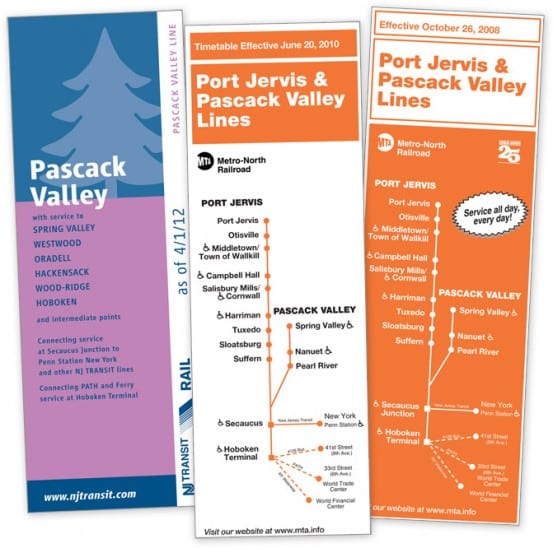
Current NJ Transit timetable for the Pascack Valley Line, and two older Metro-North timetables.
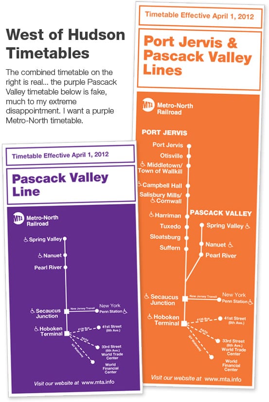
Metro-North does not print a separate timetable for the Pascack Valley line – it is combined with the Port Jervis Line and colored orange. I wanted a purple Pascack Valley timetable though, so I faked it!

Purple FTW.
I guess by shallow moron reasoning Pascack Valley has to be my favorite line then :P
Too bad Danbury branch isn’t purple ;)
Back in the 90s the MN timetable was only for the Port Jervis Line http://rides.webshots.com/photo/2420986240039645027kamYXR but like you said, MN didn’t publish a PVL timetable at all, you had to get an NJ Transit one.
The work “Pascack” was used 12 times in this post.
Up here in Boston we have purple timetables to go along with our purple trains!
I like your purple trains!
I’m not sure I agree that the drop shadow is as “cheap-looking” as you think it is but I will admit that far too many design elements are just a click away for people who don’t know better.
Witness the hideous MTA logo with too much of the left side of the “M” cut off. How did that ever get past the first review? Compare and contrast with Paul Rand’s iconic “IBM” logo.
I meant actual functioning lines, of which Danbury was my first to ride, so therefore my favorite :)
Have you ever been to Sweden? Then you must LOVE the PÃ¥gatÃ¥gen in Scania in the South. They’re all purple, although the new ones are more blueish purple then the older ones.