The Harlem Line, and the color blue

Friday, September 21st, 2012
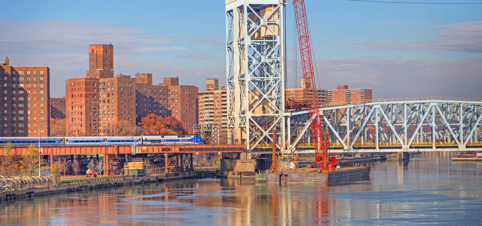
Just the other day I was chatting with a coworker about riding the train – she lives in Mount Vernon and mentioned occasionally riding the “red line” into the city. I had to chuckle a little bit – it is usually the uninitiated newbies that refer to the Metro-North lines by their colors. The color of each line, however, is deeply ingrained in all of us. From the signage on the platforms to the printed timetables, we all pretty much know that the Hudson Line is green, the Harlem blue, and the New Haven red. But where did these colors come from, and how long have they represented each line?
Most obvious is the New Haven Line. The New York, New Haven & Hartford Railroad, of which today’s New Haven Line was once a part, long used red for printing and locomotive paint schemes. Although not part of the core Metro-North lines on the east of the Hudson River, I’ve always thought that the selection of orange to represent the Port Jervis line was a little bit clever – much of the line runs through Orange County. I’m not sure how the Harlem became blue, and the Hudson became green (you’d think it is backwards – blue seems more appropriate for the line that runs along the Hudson River), the two colors have been established long before Metro-North ever came into being. Their first usage on timetables dates back to around 1965.

One of the very first (in not the first) New York Central timetables where the Harlem Division is colored blue.

The first uses of the blue and green color for the Harlem and Hudson Divisions was not in the ink – it was the paper. These two are from April 1967.

Some of the earliest timetables using blue ink. Although there were a few more printings of timetables on blue paper, the blue ink on white paper became the standard, which continues today.
Blue ink on white paper eventually became the standard for Harlem timetables, though there were a few times over the years where the rules were totally broken. One of the most odd was an early timetable printed by Metro-North in 1983 – in maroon ink. I have no idea why anyone would have thought to print a Harlem Line timetable in maroon – my only assumption is that it was to catch people’s attention as it highlighted the electrification project underway north of White Plains.
Most amusingly, you’ll note a little mark on the bottom right that reads “Form 112.” Form 112 was the number assigned to Upper Harlem timetables since the New York Central days, which at that time meant service from Pawling to Chatham (or in the early 1900′s, North Adams, Massachusetts). It is a little bit odd to see that form number used for service north of White Plains. Calling stations like Valhalla, or Mount Kisco the Upper Harlem seems like blasphemy to me.
Today you won’t find form numbers on any of Metro-North’s timetables. Their inclusion in the early timetables almost seems like an in-joke amongst the old railroaders working for this new company. You won’t see “Upper Harlem” timetables either – the entire line is usually printed in a single timetable, making this particular timetable rare.
Below is the rest of the timetable, which is a bit interesting to see… especially the listing of the fares when Metro-North took over from Conrail in 1983.


