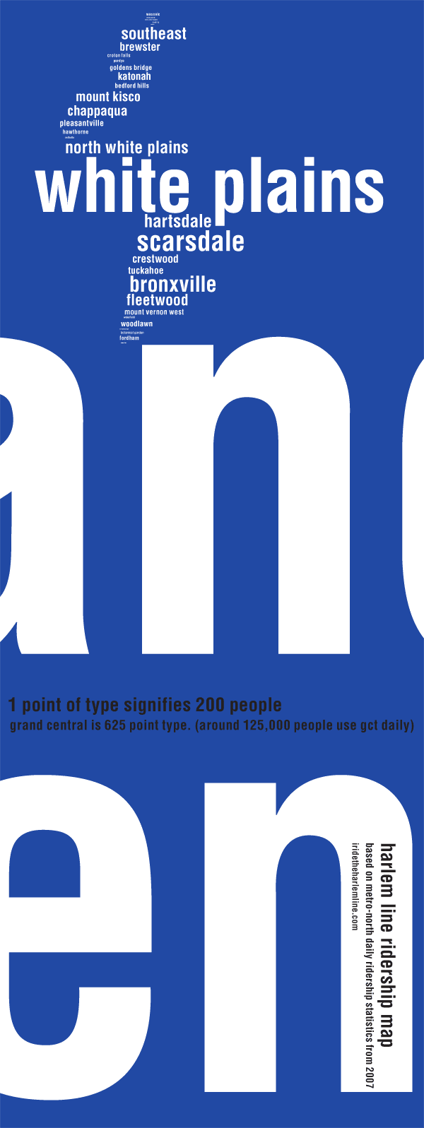
Obviously not much help in navigating, this map gives the viewer the idea of how many people pass through the various stations on the Harlem Line daily, in a vague outline of the line. The bigger the text, the more riders that station has daily. A few stations have so few riders in comparison, thus they are impossible to see on this map. Grand Central is so incredibly large that it has been cropped in order to see the rest of the stations.
The little graphic designer in me made me do this map. I had fun. Thanks to the folks at the railroad.net forums that helped me find these statistics.

